Designing the Worst T-Shirt Ever (So You Don’t Have To)
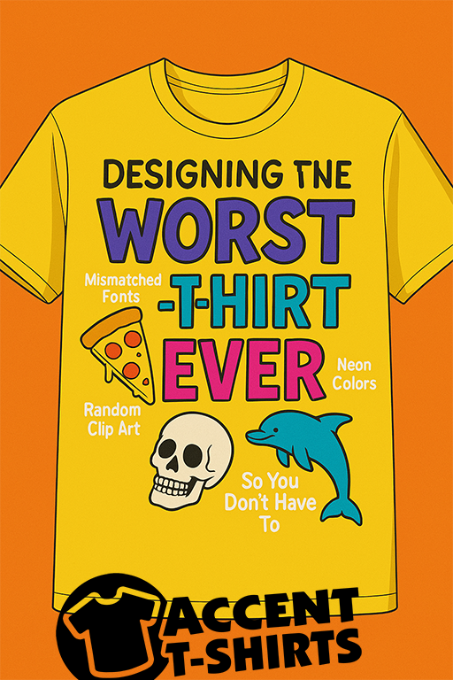
At AccentTShirts.com, we know what makes a great custom shirt: clean designs, bold prints, thoughtful layout, and high-quality embroidery. But what happens when you do everything wrong? Well, you get the Worst T-Shirt Ever—a glorious disaster of design decisions that serves as a perfect "what not to do."
So let’s walk through this fashion tragedy, not to shame it, but to learn from it (and maybe laugh a little along the way).
1. Comic Sans in Neon Green on Neon Yellow
If your goal is to cause eye strain and offend graphic designers everywhere, this is the dream combo. Comic Sans has its place (maybe a birthday card from your grandma), but on a shirt? Paired with two retina-burning colors? It's a design meltdown.
Lesson: Stick to high-contrast combos and clean, readable fonts like Helvetica, Futura, or bold sans-serifs.
2. Clip Art Explosion (With No Theme)
You want a pizza slice, a dolphin, a skull, and a cowboy hat—on one shirt. Why? Who knows. But it’s all jammed on there, like a 3rd grader discovering WordArt for the first time.
Lesson: Cohesive design is key. Choose imagery that aligns with your brand, message, or event. Less is usually more.
3. Centered Text That's Somehow... Crooked?
Nothing screams "DIY disaster" like misaligned text. Especially when it's center-aligned but actually not. And don’t even get us started on accidental upside-down prints.
Lesson: Proper placement is essential. At Accent T-Shirts, we use professional templates and equipment to get things just right.
4. Embroidery Overload
Embroidery can be classy and durable—but when you try to fit an entire poem on the front of a polo, things get real weird, real fast. Tiny text doesn’t stitch well. Neither do highly detailed graphics.
Lesson: Embroidery works best with simple, bold logos and concise text. Save the epic quotes for the back of a screen printed tee.
5. The Shirt That Tries Too Hard to Be Funny
"I'm Nacho Average Dad Bod Champion 2024 #YOLO #GuacOn" in ten different fonts. We’ve seen it. We respect the effort. But sometimes less cringe is more cool.
Lesson: Humor is awesome when it feels authentic. Keep it simple, clever, and well-designed.
Bonus Fail: Putting Text on the Belly
Unless you're printing maternity shirts or novelty beer belly tees, text placed right on the gut is just awkward. And weirdly hard to read when someone sits down.
Lesson: Chest and back placement are classic for a reason.
Design Like a Pro (Or Let Us Help!)
We joke because we care. At Accent T-Shirts, we take pride in helping our customers create apparel they actually want to wear—whether it’s screen printing, embroidery, or something custom and creative.
If you ever feel stuck or overwhelmed by design choices, our team is here to guide you. Or, if you really want to make the Worst T-Shirt Ever for fun... we’ll print that too. No judgment.
Visit AccentTShirts.com to get started—and remember: friends don’t let friends use Comic Sans on neon yellow.