T-Shirt Printing
Color Theory & Apparel: How the Color Wheel Shapes Shirt Design | Accent T-Shirts
11/14/2026
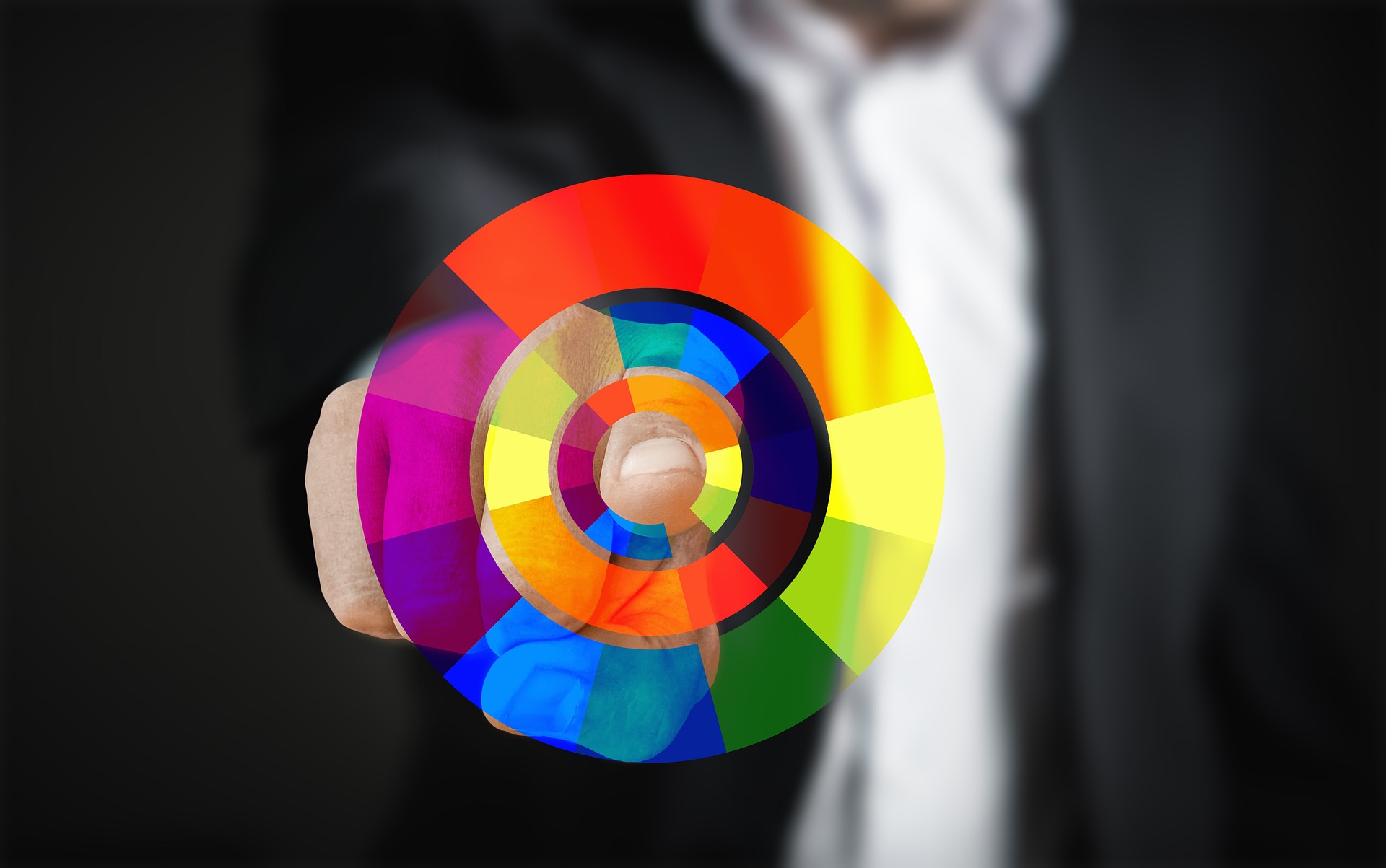
<h2>Mastering the Palette: How the Color Wheel Shapes Modern Shirt Design
Whether you are building an outfit from your wardrobe or designing a custom graphic tee from scratch, the secret to making a shirt look effortlessly stylish comes down to one timeless visual tool: the color wheel.</h2>First organized by Sir Isaac Newton in 1666, the 12-color wheel is far more than a tool for painters—it is the foundational cheat sheet for garment dyeing, graphic print design, and modern streetwear styling. At Accent T-Shirts, we rely on color theory to ensure every graphic print pops, every fabric pairing feels intentional, and every t-shirt elevates your personal style.
1. The Core Color Schemes in Shirt Design
Understanding how colors interact on the wheel allows you to control the mood, contrast, and visual energy of any t-shirt design or layered outfit.
Complementary Colors (High Contrast & Maximum Energy):
Colors located directly opposite each other on the wheel—such as blue and orange, red and green, or purple and yellow—create the highest visual contrast. In t-shirt graphics, pairing complementary colors makes logos and typography jump off the chest. Think of classic vintage sports tees or retro streetwear drops; complementary pairings command immediate attention.
Analogous Colors (Harmonious & Low Tension):
Analogous colors sit next to each other on the wheel, such as forest green, olive, and yellow-green, or navy, royal blue, and teal. Using analogous shades creates a smooth, cohesive look with zero visual jarring. These palettes are heavily used in modern earth-toned apparel, subtle gradient prints, and tonal streetwear collections.
Triadic Colors (Balanced & Vibrant):
A triadic scheme uses three colors spaced evenly around the wheel, such as red, yellow, and blue, or orange, green, and violet. Triadic palettes offer high energy while maintaining visual balance, making them a staple for 90s-inspired graphic tees, pop art prints, and multi-color chest graphics.
Monochromatic & Achromatic Schemes (Clean & Minimalist):
Monochromatic designs use varying shades, tints, and tones of a single hue (for example, layering a light slate t-shirt with charcoal graphics). Achromatic outfits skip chromatic colors entirely, relying on black, white, and grays. This approach forms the backbone of modern minimalist streetwear, where clean contrast and fabric texture take center stage.
2. Fabric Ground Colors vs. Print Inks
One critical aspect of shirt design that differs from digital art is the relationship between the fabric base (the shirt color) and the print ink (the graphic).
Warm Bases (Reds, Yellows, Oranges): Warm shirt bases naturally pull focus forward and create high-energy garments. Printing cool tones (like cyan or navy) on warm fabrics creates crisp, readable contrast.
Cool Bases (Blues, Greens, Purples): Cool fabrics feel relaxed, grounded, and versatile. Placing warm graphics (like amber or cream) onto cool garments creates a classic retro feel that is easy on the eyes.
Neutral Bases (Black, White, Heather Gray, Cream): Neutral fabrics act as canvas anchors. A black or white t-shirt allows any color scheme from the wheel to function without competing against the garment itself.
3. How to Pair Shirts Using Color Theory
Beyond designing prints, the color wheel provides a clear guide for pairing t-shirts with jackets, pants, and sneakers:
Shirt Palette
Recommended Bottoms / Outerwear
Visual Effect
Monochromatic Slate / Gray
Black denim, dark charcoal hoodie
Sleek, modern, minimalist
Complementary (Blue Graphic)
Raw indigo jeans, tan/wheat jacket
High contrast, classic Americana
Analogous Earth Tones (Olive/Brown)
Khaki chinos, beige canvas jacket
Warm, outdoor-inspired cohesion
Bold Triadic Graphic Tee
Neutral black or dark navy pants
Lets the shirt graphics stand out
The Lasting Legacy on Accent T-Shirts
Understanding the color wheel removes the guesswork from apparel. Whether you are balancing high-contrast graphics on a vintage tee or curating a minimalist tonal outfit, color theory provides the structure behind great personal style.
At Accent T-Shirts, every shirt we craft relies on these time-tested color relationships. Choose the palette that speaks to your energy, experiment with contrast, and wear your colors with confidence.