Written by Lindy Williams | Accent T-Shirts | Las Vegas, Nevada
Las Vegas has never been a city that does anything halfway. From the neon signs of old Fremont Street to the massive resorts lining the Strip, this town has always understood one thing: if you want someone's attention, you've got to give them something worth looking at.
And then came the Sphere.
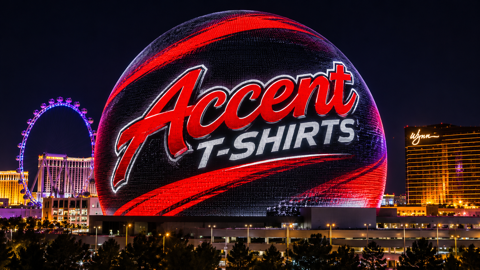
Love it or hate it, you can't ignore it. One minute it's a giant glowing eyeball staring across Las Vegas. The next, it's a planet, a basketball, or some incredible animated creation that makes you wonder how someone even dreamed it up.
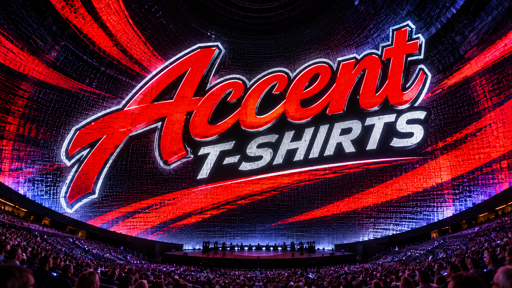
As someone who's spent more than 30 years working in graphic design and has owned Accent T-Shirts here in Las Vegas since 1999, I find the Sphere fascinating.
Not just because of the technology, but because it demonstrates some of the same design principles I've used for decades.
The canvas might be a little bigger than a T-shirt, but the fundamentals haven't changed.
1. Great Design Gets Your Attention Immediately
The Sphere doesn't have the luxury of explaining itself.
People driving down the Strip aren't stopping to read paragraphs about what they're seeing. The visuals have to communicate almost instantly.
That's exactly how great graphic design works.
Whether you're designing a concert T-shirt, company logo, promotional product, or billboard, you've got a very short window to make an impression.
A strong design should grab attention, communicate an idea, and make someone want to look a little longer.
Sometimes the simplest designs make the biggest impact.
The lesson: If your design needs a five-minute explanation, it might be trying too hard.
2. Color Is More Powerful Than You Think
One of the most impressive things about the Sphere is its use of color.
Bright, saturated colors against the Las Vegas night sky create incredible contrast. Even relatively simple imagery becomes dramatic when the colors are right.
The same principle applies to screen printing and apparel design.
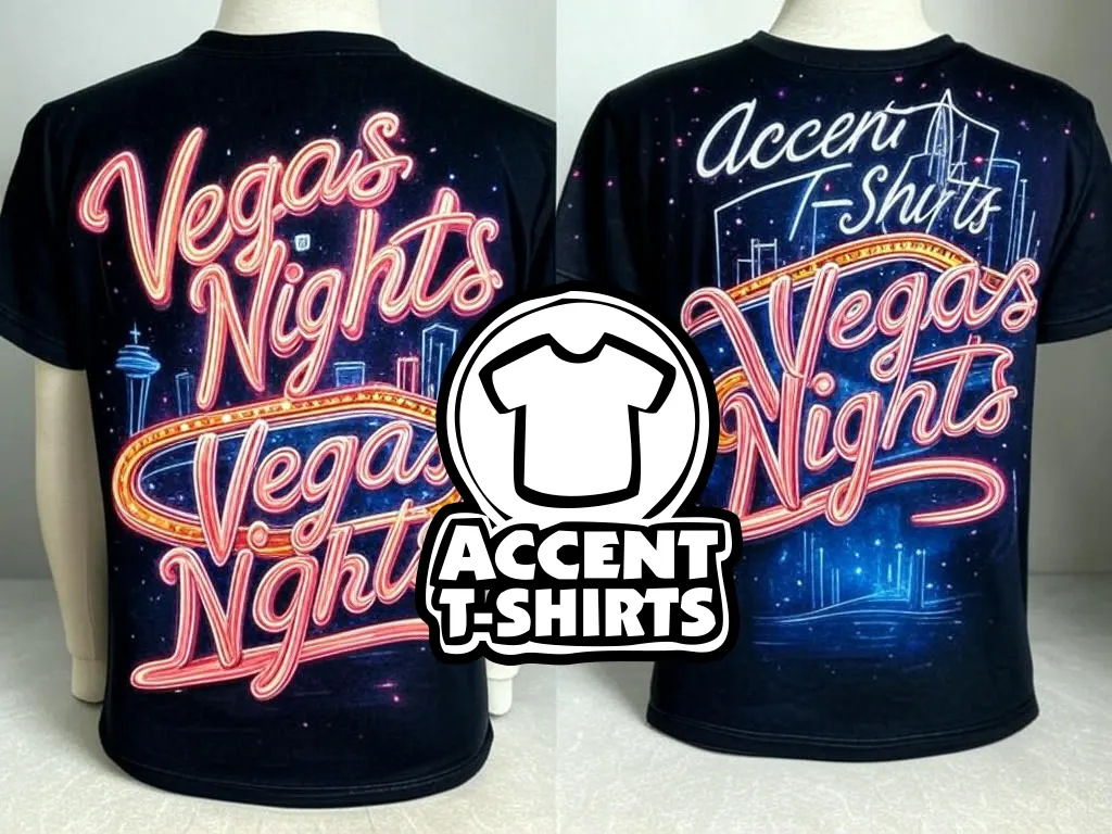
A bright orange graphic on a black shirt can make a bigger impression than a complicated design featuring ten different colors.
It's not always about how many colors you use. It's about how effectively you use them.
At Accent T-Shirts, we work with color combinations every day, from traditional spot-color screen printing to full-color DTF transfers.
And after all these years, I've learned that sometimes taking a color away makes a design better.
The lesson: Don't just choose colors because they look good individually. Choose colors that work together.
3. Size Changes Everything
Here's something graphic designers learn pretty quickly: a design that looks amazing on a computer screen doesn't necessarily look amazing everywhere else.
The Sphere takes that challenge to an entirely different level.
Imagine designing something that wraps around a massive spherical building and still needs to look recognizable from different angles and distances.
Now think about designing a logo that has to work on a business card, an embroidered hat, a website, and the back of a T-shirt.
It's the same fundamental challenge.
Good design needs to be flexible.
Fine details might disappear when embroidered. Small lettering might become unreadable when reduced. A complicated illustration might look incredible on a poster but become a mess on a promotional pen.
The lesson: Design for where the artwork will actually be seen, not just how it looks on your monitor.
4. Movement Is Cool, but the Idea Still Matters
The Sphere can make images move, transform, rotate, and seemingly come alive.
But here's the thing: all that technology doesn't automatically make something a great design.
There still needs to be an idea behind it.
That's something I think gets overlooked in today's world of artificial intelligence, design software, and endless digital effects.
Technology makes it easier than ever to create something visually impressive.
But there's a difference between making something look cool and creating something that actually communicates.
I've always believed the best designs start with an idea, not an effect.
You can add all the gradients, textures, animations, and special effects you want, but if the concept isn't there, you're just decorating.
The lesson: Start with a strong idea. Let the technology help bring it to life.
5. Know Your Audience
The Sphere is a perfect example of understanding an audience.
Las Vegas visitors expect entertainment. They expect something unusual. They want an experience they can't get anywhere else.
The Sphere delivers on that expectation before anyone even walks through its doors.
Good branding works the same way.
A construction company probably doesn't need the same visual identity as a punk rock band. A corporate convention needs a different approach than a motorsports event.
The best designs reflect the personality of the people they're meant to reach.
Over the years, I've worked on artwork for businesses, events, race teams, musicians, and organizations. Every project has its own audience, personality, and purpose.
Understanding those things is just as important as knowing how to use design software.
The lesson: Design for the people you're trying to reach, not just your own personal taste.
6. Sometimes You Have to Break the Rules
One of my favorite things about Las Vegas is that it's never been particularly interested in playing by the rules.
The Sphere is proof of that.
Somebody looked at traditional entertainment venues and decided a giant illuminated sphere would be a better idea.
That's the kind of thinking that pushes creativity forward.
I've always been drawn to the more unconventional side of graphic design: music graphics, racing artwork, punk-inspired illustrations, and designs with a little attitude.
Not every project calls for something outrageous, but there's something to be said for trying an idea that feels a little different.
Sometimes the design that makes everyone nervous is the one people remember.
The lesson: Learn the rules of design, but don't be afraid to bend them when the idea calls for it.
From the Sphere to a T-Shirt
Obviously, we're not wrapping a giant building in LED screens over here at Accent T-Shirts.
We're printing shirts, embroidering hats, creating promotional merchandise, and helping businesses bring their ideas to life.
But the creative process really isn't all that different.
It starts with an idea.
You figure out who it's for, what you want it to communicate, and how to make it visually interesting.
Then you bring it to life.
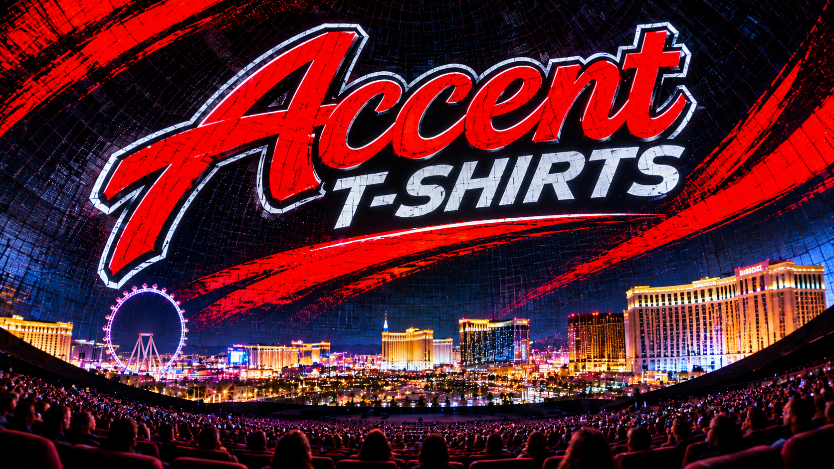
The Sphere might be one of the most impressive visual displays ever built in Las Vegas, but great design doesn't have to be enormous to make an impact.
Sometimes it's a simple logo.
Sometimes it's a concert shirt you keep for 30 years.
And sometimes it's a T-shirt someone sees across a crowded room and says, "Hey, where'd you get that?"
That's the kind of design I still love creating.
Creativity Has Always Been Part of Las Vegas
I've been fortunate to spend decades working in the creative industry right here in Las Vegas.
And if there's one thing this city has taught me, it's that there's always room for another big idea.
The tools change. The technology changes. The trends definitely change.
But great graphic design still comes down to creativity, communication, and making something people remember.
The Sphere just happens to be a pretty spectacular reminder of that.
---
About the Author
Lindy Williams is a Las Vegas graphic designer with more than 30 years of experience in graphic design, custom apparel, and promotional branding. He is the owner of Accent T-Shirts, established in 1999, and is also involved in Race Day Outfitters and LindyDesign.com.
Accent T-Shirts provides custom screen printing, embroidery, DTF printing, and promotional products for businesses, events, and organizations in Las Vegas and beyond.
Accent T-Shirts
www.accenttshirts.com
702-866-8888
team@accenttshirts.com
Your Brand. Our Passion. Since 1999.