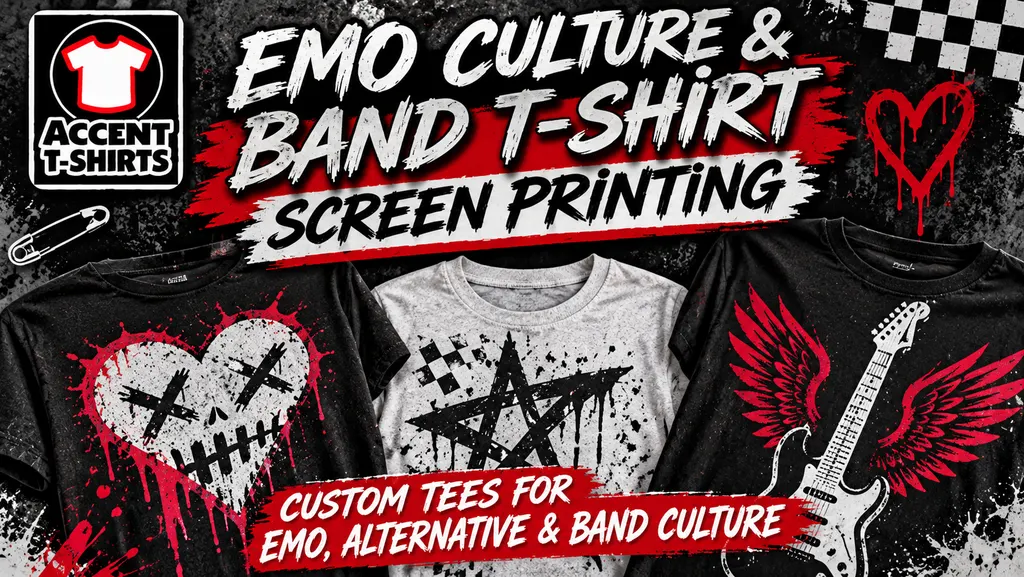
Long before aesthetic trends were dictated by algorithm feeds and instant viral drops, a subculture was quietly building its identity out of distorted guitars, handwritten lyricism, and stark, screen-printed merch. The emo movement of the late 1990s and 2000s did not merely adopt graphic apparelâit redefined what a t-shirt meant to the wearer.
For kids in basement venues, suburban garages, and crowded festival grounds, a band tee wasn't just promotional material bought at the door; it was a flag, an emotional shield, and a public confession. Screen printing became the visual voice of a generation that traded polished mainstream pop for raw, unfiltered vulnerability.
At Accent T-Shirts, we have printed apparel through every major shift in music and fashion over the past three decades in Las Vegas. Looking back at the aesthetic explosion of emo culture reveals how a niche music movement transformed screen printing techniques, garment fits, and graphic design rules for modern streetwear.
The Fit Shift: From Oversized Metal Graphics to the Fitted Silhouette
To understand the impact of emo on apparel, you have to look at the physical garment itself. In the early to mid-1990s, band merch was dominated by heavy metal and grunge aesthetics: boxy, heavy-weight, oversized t-shirts with massive, colorful prints spanning edge to edge.
Emo culture reversed that standard completely:
The Rise of the Youth/Junior Fit: Bands and fans started seeking out slim-fitting, lightweight ring-spun cotton tees. The tight, fitted silhouette mirrored the intimate, raw nature of the music.
The "Boyfriend/Girlfriend" Tee Swap: Gender-neutral styling became the norm. Male fans regularly bought fitted girls' blanks or slim-fit unisex garments long before mainstream fashion embraced gender-fluid apparel lines.
Fleece & Zip-Up Layering: Dark, fitted full-zip hoodies with minimalist left-chest prints or sleeve typography became the official uniform for cold venue parking lots and late-night drives.
This demand pushed garment blank manufacturers to produce lighter, softer, and more tailored options, laying the groundwork for the modern fashion-fit blanks used by streetwear brands today.
Visual Language: Minimalism, Macabre, and Handwritten Typography
The graphic design of emo merchandise stepped away from complex photographic layouts and embraced high-contrast visual storytelling. The artwork was designed to look hand-drawn, intimate, and intentionally unpolished.
Print shops saw a massive surge in specific design tropes that defined the genre:
Stark High-Contrast Spot Colors: Black ink on stark white tees, or bright crimson red and bone white ink printed over jet-black garments. This limited color palette kept production costs accessible for touring indie bands while creating immediate visual impact.
Macabre Romanticism: Anatomical hearts, sparrows, skeletal hands, weeping eyes, razor wire, and bleeding roses filled art boards. These symbols transformed internal emotional states into physical line art.
Typography as Art: Monospaced typewriter fonts, handwritten script, and distressed serif lettering carried lyric quotes across upper backs, sleeve prints, and lower side hems.
Screen Printing Mechanics: Soft-Hand Inks & Dark Fabric Precision
Emo merch relied heavily on dark garmentsâpredominantly jet black, heather charcoal, deep navy, and dark burgundy. Printing bright artwork on dark cotton presents technical challenges that shaped how print shops approached ink application.
To keep a black shirt soft and comfortable rather than heavy and stiff, screen printers refined specialized ink methods:
Discharge Ink Separations: By using discharge bases that bleach the fabric's original dye and replace it with fresh pigment, print shops could create brilliant white and red graphics with zero heavy ink feel ("zero-hand feel").
Smooth Plastisol Underbases: For bold, opaque graphics that needed crisp contrast, printers developed ultra-fine mesh screens and thin underbase coats to avoid the thick, rubbery print texture that fans disliked.
Distressed Vector Separation: Halftone textures and distressed vector brushes were built directly into screen separations to give brand-new prints an authentic, worn-in look right off the press.
The Legacy: How Emo Merch Built Modern Streetwear Drops
If you look at todayâs high-end streetwear and merch dropsâfrom hip-hop artists using punk typography to indie brands releasing limited-run black hoodiesâthe influence of emo merch is everywhere.
The subculture pioneered the limited venue-exclusive drop. Bands would print 100 copies of a specific graphic for a single tour, creating immediate scarcity and collector value. Decades later, those original screen-printed band tees sell on secondhand marketplaces for hundreds of dollars, not just as vintage clothing, but as authentic artifacts of a subculture built on heart, ink, and cotton.
Whether you are printing merch for an indie band tour, launching an emo-inspired fashion brand, or creating custom apparel for a local venue, getting the ink texture, garment fit, and print quality right is everything.
At Accent T-Shirts, we bring decades of custom screen printing and embroidery experience to every project right here in Las Vegas.
Visit our shop at 2545 E. Chandler Ave. Ste. 11, call us at (702) 866-8888, or request your quote online at AccentTShirts.com.