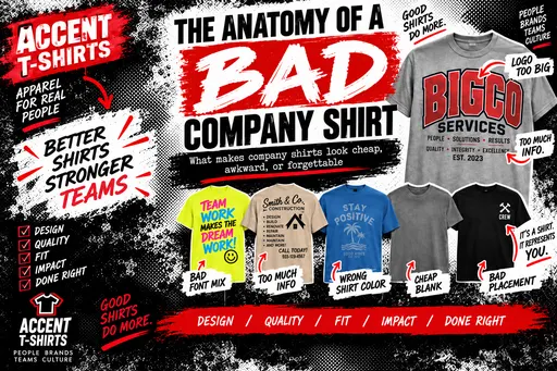
What makes a company shirt look cheap, awkward, or forgettable? Here’s a breakdown of the most common design mistakes and how to avoid them.
A company shirt can do a lot for your business.
It can make your staff look professional. It can help people recognize your brand. It can turn employees and customers into walking advertising.
It can also look terrible.
And when it does, the problem usually is not the printing.
It is the decisions made before the shirt ever gets near a press.
Here is the anatomy of a bad company shirt.
1. The Logo Is Way Too Big
This is probably the most common mistake.
A customer sees a blank shirt and thinks, “We paid for a logo, so let’s use all of it.”
The result is a giant chest print that looks less like branding and more like a billboard.
Bigger is not always better.
A logo that is slightly smaller and placed correctly often looks more professional, more wearable, and more expensive.
If people feel like they are wearing an advertisement, they probably will not wear the shirt very often.
That defeats the whole purpose.
2. There Is Too Much Information
Your company shirt does not need to be your entire website.
We have seen shirts with:
- Company name
- Logo
- Phone number
- Website
- Address
- Tagline
- List of services
- Social media handles
- QR code
- And somehow still room for “Family Owned Since 1987”
At some point, it stops being a shirt and starts becoming a flyer.
Good apparel design usually has a hierarchy.
One thing should be the main focus.
Everything else should support it.
3. The Font Is Fighting the Logo
A strong logo can be ruined quickly by adding the wrong font underneath it.
Script font with an industrial logo.
Comic-style lettering next to a corporate mark.
Three different fonts because someone wanted to “make it interesting.”
Fonts have personalities.
If they do not match the brand, the shirt can feel thrown together even when the customer cannot explain why.
The best design often uses fewer typefaces, not more.
4. The Shirt Color Was Chosen Last
This happens all the time.
The logo is designed first.
Then someone says, “Let’s put it on a royal blue shirt.”
Unfortunately, half the logo is also royal blue.
Now we have a problem.
Shirt color is part of the design.
A graphic that looks great on white may disappear on charcoal. A black logo may need modification on a dark shirt. Certain colors may need an underbase or alternate thread color.
The garment and artwork have to work together.
5. The Cheapest Shirt Became the Default Shirt
There is nothing wrong with using an inexpensive blank.
There is something wrong with choosing one without considering how it will actually be worn.
If the shirt is uncomfortable, boxy, heavy, scratchy, or badly fitted, employees will wear it once and then bury it in a drawer.
Sometimes spending another dollar or two per shirt makes a massive difference in how the finished product feels.
A shirt people actually want to wear is worth more than a cheaper shirt nobody wants.
6. The Artwork Was Never Designed for Apparel
Your logo may work perfectly on a website.
That does not mean it will work perfectly on a shirt.
Tiny text, thin lines, gradients, shadows, complex color blends, and extremely detailed artwork can create problems when printed or embroidered.
Sometimes the artwork needs to be simplified.
That is not ruining the logo.
It is adapting the logo to the medium.
The best brands often have multiple versions of the same logo for exactly this reason.
7. Every Available Print Location Was Used
Front.
Back.
Left sleeve.
Right sleeve.
Maybe the neck.
Maybe the pocket.
Maybe the bottom hem just in case.
Just because we can print somewhere does not mean we should.
Multiple locations can look great when they are intentional.
But filling every open space usually makes the shirt feel busy and overdesigned.
Sometimes one excellent left-chest print and one strong back graphic is all you need.
8. The Back Print Is Too Low
This one sounds small, but it makes a big difference.
A back print that sits too low can make the whole shirt look awkward.
The artwork should generally feel like it belongs across the shoulder-blade area, not halfway toward the waist.
Placement affects how people perceive the design before they even notice the artwork itself.
This is why print position should never be an afterthought.
9. Somebody Said “Make It Pop”
Those three words have caused a lot of unnecessary suffering.
“Make it pop” usually means:
Make it brighter.
Make it bigger.
Add an outline.
Add another color.
Add a shadow.
Add a glow.
And then maybe add another outline around the outline.
Eventually, the clean logo you started with looks like a casino sign.
Sometimes the thing that makes a design stand out is restraint.
10. The Shirt Looks Like a Uniform Nobody Wants to Wear
There is a difference between branded apparel and mandatory clothing.
The best company shirts blur that line.
They still represent the business, but they look good enough that someone might wear them after work.
That is the goal.
Restaurants, breweries, gyms, automotive shops, contractors, salons, and all kinds of businesses have figured this out.
The staff shirt does not have to look boring.
In fact, the more wearable it is, the more valuable it becomes to the brand.
What Does a Good Company Shirt Look Like?
Usually, it is pretty simple.
A comfortable garment.
A strong logo.
Good placement.
The right print size.
Colors that work together.
And enough restraint to let the design breathe.
The goal is not to cram as much information onto the shirt as possible.
The goal is to create something people are happy to put on.
That is the difference between company apparel and a walking advertisement.
At Accent T-Shirts, we help businesses figure out what will actually work before production starts.
Sometimes that means making the logo smaller.
Sometimes it means removing information.
Sometimes it means recommending a better shirt.
And sometimes it means saying, “You really do not need all that.”
Because a good company shirt should make your business look better.
Not busier.
Lindy Williams
Accent T-Shirts
702-866-8888
AccentTShirts.com
WRITTEN BY LINDY WILLIAMS